Dope Shit Stay Up ^.


Dope Shit Stay Up ^.
iHustle..
damn shit is dope tuckzz hook it up wit a sig
yeah, i could take a request

im feelin a lot of dem Tuckz
RB OG Triple OG
To view links or images in signatures your post count must be 50 or greater. You currently have 0 posts.
werd, thanx.
yo tuckszz did u get my request

damn tuckzz you got some dope sigs...how long you been a grahix designer for?
ay im feelin all ur sigs but tha text just ruins tha whole sig..........in all ur sigs tha text looks blurry or squished or sum so fix dat and it would be dope or just dnt put text on any of them and it will look betta than they do now
To view links or images in signatures your post count must be 50 or greater. You currently have 0 posts.
OH YEA
To view links or images in signatures your post count must be 50 or greater. You currently have 0 posts.
thanx for da feed.

good shit. i like the elagiac one.
thanks
nice fam..........keep ur shit up homes.
dopeness.
think you can get at me and send me some brushes?!
Open Mic
To view links or images in signatures your post count must be 50 or greater. You currently have 0 posts.
To view links or images in signatures your post count must be 50 or greater. You currently have 0 posts.
Written Voices
Ayo tuCkzz Are You Taking Any Request's ?
iHustle..
I'm posting off what was on the first page.. and I'll post some real feed =p
You can't really become a good graphics artist by using brushes only. Brushing is supposed to be used as creating depth, not by brushing and putting render and text on top. I think if you were able to switch up your style, you'd understand more of what I'm saying. It'd make you the better artist. And with depth, you need to make your artworks more dimensional. A lot of the renders you've been using are just flat faced, duplicated renders with overlay, soft light, etc.
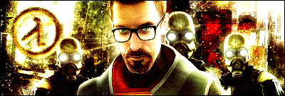
This is really old, I know. But it's just an example on how to make thing proportional. I also used a few jashin brushes to add some texture to a picture I found of an old warehouse (to resemble half life 2). I then tried to make a viewpoint as where the focal point is in the middle and expanding to the sides. That is what I mean by flatfaced.
I mean, you can take some my ideas and play with them. That sig I posted I edited about 20 times before I was actually pleased with a result. I changed the color of that thing from red to blue to a nice shade of gold that I liked.
Art doesn't ahve to be so complex either. I used no brushes at all and everything there has been hand cut and created. It creates a playful tone, and in my opinion, is one of my favorite.
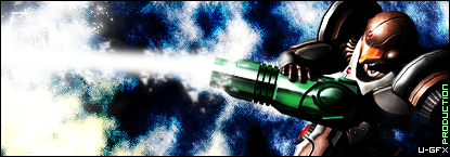
That is an example of a FILTER sig only. All I used was filters. Just another example of staying away from brushing.
I don't mean to offend you or anything, but when I see that sig is piled with brushes, it bothers me because in most cases a: you didn't make your own brushes and b: you can make it look A LOT better without brushing. I personally discarded most of my brushes and I created a few of my own + a few premade ones that I use for photo manipulation and render blending.
Anyways, I was bored at school so I decided to right up something in the meantime, if you help just IM me @ Que Pasa Mayne.
pce.
Last edited by Vindictive; May 4th, 2006 at 02:45 PM
- u n r e a L -
. . . and yet still keep shit real
To view links or images in signatures your post count must be 50 or greater. You currently have 0 posts.
the one since '99
werd, thats the kind of feed im trying to find out here...thanx V
 Posting Rules

 Reply With Quote