


To view links or images in signatures your post count must be 50 or greater. You currently have 0 posts.
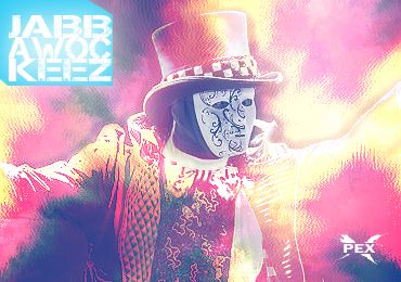
Not a fan of this one man and I been following your work since you got here. I dunno. The colors and background seem not just bland but random. The text is meh. And I'm not a fan of the fact it's square.
appreciate the feedback. yea I was bored playing with the smudge tool and filters .
To view links or images in signatures your post count must be 50 or greater. You currently have 0 posts.

Dopest one ever!
[/url]

I actually like it just not feeling the "jabbawockeez" in the upper left.
To me, going with the square design is different and it can absolutely work.
Add & Follow
To view links or images in signatures your post count must be 50 or greater. You currently have 0 posts.
·
To view links or images in signatures your post count must be 50 or greater. You currently have 0 posts.

this could've been alot better if you placed the smudge effects as the backgrounds instead of overlaying them on the character, it could have been a perfect color scheme and overall a dope piece, but it's also too bright.. keep on it
 Posting Rules


 Reply With Quote